Swifdoo PDF App Review: Lightweight, Fast & Affordable PDF Editor for All Your Documents
SwifDoo PDF isn’t just another PDF reader: it’s a full-fledged PDF productivity suite, especially beneficial for startups, small-to-medium teams, freelancers, and businesses that handle frequent PDF documents.
SwifDoo PDF provides a complete set of PDF tools, from basic editing to advanced AI-powered features. All of these tools work together to replace multiple separate apps with one single platform.
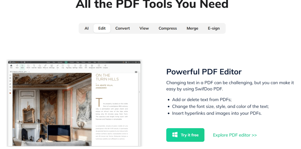
The core functionality is PDF editing. You can change text, insert images, adjust fonts, add hyperlinks, and edit content just like you do in Word. If you ever needed to fix a small typo or update a clause in a PDF, SwifDoo makes it simple.
Next comes PDF conversion. You can convert PDFs to Word, Excel, PowerPoint, images, CAD drawings, and more. This is extremely useful for repurposing documents, sharing files in different formats, or working with clients who need editable versions.
SwifDoo also includes OCR (optical character recognition). If you receive scanned invoices or photographed documents, SwifDoo can convert those into editable and searchable text. This removes the need to type everything manually.
Finally, SwifDoo includes AI-powered tools such as summarization, translation, document chat, proofreading, and rewriting. These tools help busy teams process long and complex PDFs in seconds. You can extract summaries, translate text for international clients, or understand dense legal documents faster.

Quick App Snapshot
App Name: SwifDoo PDF
Best For: Startups, Freelancers, Small and Medium Businesses, Agencies, Remote Teams
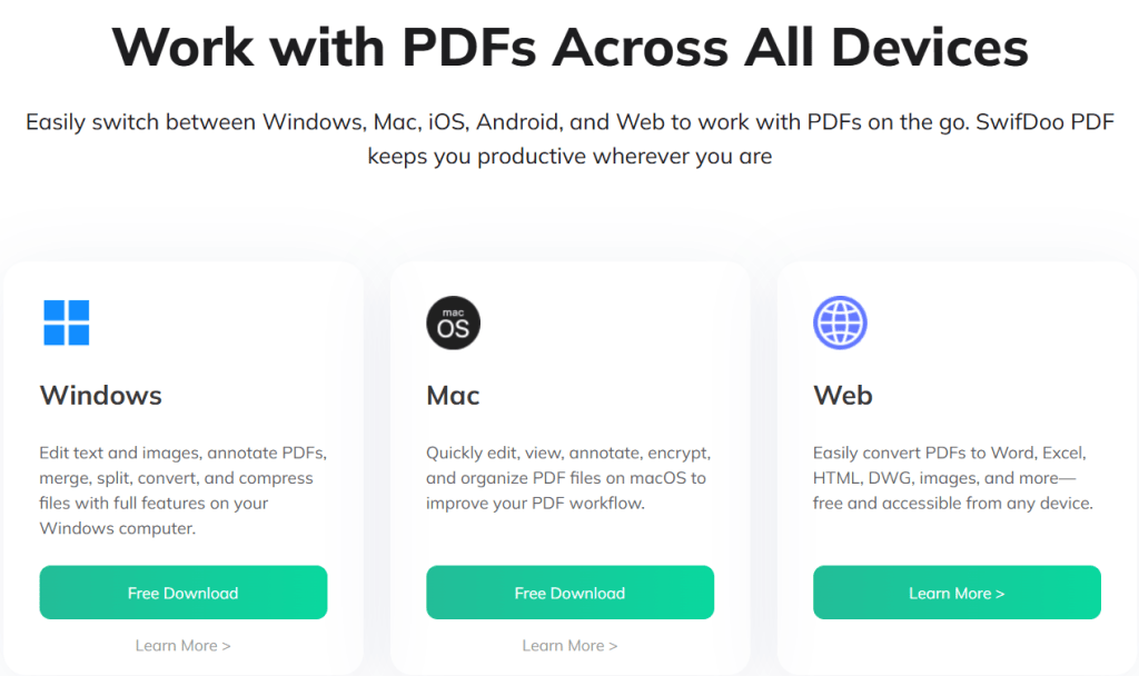
Platforms: Windows, macOS, iOS, Android, Web
Top Feature: All-in-one PDF editing, conversion, OCR, CR, and AI-powered document management
Who Is This App Really For
SwifDoo PDF is ideal for anyone who handles a large number of PDF documents and prefers not to switch between multiple tools. If your team manages contracts, invoices, design files, or reports frequently, SwifDoo will simplify your work.
Startups and small businesses that are budget-conscious can benefit from SwifDoo’s flexible pricing plans, including affordable subscriptions or a lifetime license option.
If your work requires collaboration with partners, clients, or remote employees, SwifDoo makes signing, annotating, and updating PDFs fast and hassle-free.
For businesses that receive scanned or handwritten documents often, the OCR and AI features transform these into clean, editable files and save hours of manual work.
Our Hands-On Experience
When testing SwifDoo PDF, I uploaded a 40-page contract that included tables, images, and layout elements. It opened almost instantly because of its lightweight design. Editing sections of the contract, adjusting formatting, and adding a signature were smooth and took less than five minutes.
I then tested the conversion feature by converting the PDF to Word. The layout, styling, and fonts were preserved surprisingly well. After making additional edits in Word, converting it back to PDF maintained the formatting with almost no distortion.
Next, I tried OCR on a scanned invoice. SwifDoo extracted the text with high accuracy and allowed easy editing without the need to retype handwritten lines.
Finally, I used the AI summarization on a 25-page investor pitch deck. Within seconds, it created a short and clear summary, which is extremely helpful for founders or managers who do not have time to read full documents.
Overall, the experience felt fast, intuitive, and practical for business purposes.
Features of SwifDoo PDF
PDF Editing and Annotation
SwifDoo lets you edit text, insert images, change fonts, add links, and modify PDFs with ease. This helps make quick updates to documents without recreating them from scratch.
PDF Conversion
SwifDoo converts PDFs into Word, Excel, PPT, images, and CAD formats. This is useful when different file types are needed for clients, presentations, or printing.
OCR and Scanned Document Processing
SwifDoo converts scanned documents and image-based PDFs into editable and searchable text. This helps with bookkeeping, data entry, and maintaining digital archives.
AI Tools for Summarization and Translation
Long and complex PDFs can be summarized. Text can be rewritten or translated. This is helpful for global teams, cross-border clients, and quick document understanding.
E-Signature and Document Security
You can add signatures and password-protect important files. This is especially useful for financial or legal documents.
PDF Management Tools
SwifDoo allows merging, splitting, compressing, reordering pages, and organizing files, which improves team workflows.
Pricing of SwifDoo PDF
SwifDoo offers multiple pricing options suitable for different needs.
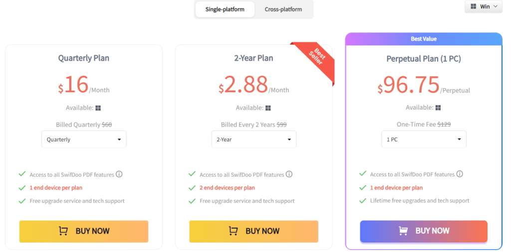
1. Quarterly Plan
Around 16 USD per month, billed quarterly.
2. Two-Year Plan
Equivalent to around 2.88 USD per month billed upfront for two years.
3. Perpetual One-Time License
A lifetime license for one PC priced at 96.75 USD. This includes lifetime access and free updates.
A free trial or free version is also available for users who want to test the tool before upgrading.
Pros and Cons of SwifDoo PDF
Pros
SwifDoo combines editing, OCR, conversion, annotation, and signing in one place. It opens quickly even on basic computers. The AI features, such as summarization and translation, add significant value. Cross-device support makes it useful for remote and hybrid teams. Flexible pricing helps budget-conscious businesses.
Cons
Some users reported occasional crash issues or installation problems on certain machines. A few advanced features are more limited on macOS compared to Windows. For large teams, per-device licensing may feel more expensive than large enterprise plans from bigger vendors.
Alternatives to SwifDoo PDF
1. Adobe Acrobat Pro
Adobe Acrobat is a powerful enterprise-level tool with advanced features like form creation, team collaboration, and top-tier security. It is more expensive and heavier than SwifDoo but preferred by enterprises.
2. PDFelement
PDFelement offers editing, OCR, conversion, and annotation features similar to SwifDoo. It is stable, polished, and popular among professionals, although SwifDoo may be more affordable and simpler for small teams.
IBR Verdict: Should You Use It or Skip It
Our Rating: ⭐⭐⭐⭐☆
SwifDoo PDF is an excellent choice for startups, small teams, freelancers, and agencies. If your work involves editing, signing, summarizing, translating, or converting PDF documents frequently, SwifDoo will save you time and reduce tool switching.
It offers great value, strong features, and smooth performance without heavy system requirements. For most small and mid-sized businesses, SwifDoo is a smart and cost-effective choice.
If you require advanced enterprise workflows or heavy collaboration features, alternatives like Acrobat or PDFelement might be better suited.
Try SwifDoo PDF using their free version and test it on your daily documents. See how much time you save by having all your PDF tools in one place.
You can read similar app reviews on ikanabusinessreview.com.
Need help building a website or app for your business?
Contact us at ikana.io
Libby: The Free Library App That Brings E-Books & Audiobooks to Your Team
Libby’s core functionality centers on borrowing digital content from public libraries. It connects directly with a user’s local library (or multiple libraries) once they sign in with a library card. Users can browse the library’s catalog, borrow available titles, place holds on titles that are currently checked out, and manage loans, all within the app. Importantly, these loans are free, and Libby does not require any purchase of the content.
Libby supports different media formats: ebooks, audiobooks, and magazines. For ebooks, users can customize their reading experience, change font size, background color, zoom into images (especially for magazines or comics), highlight, bookmark, and even define words. For audiobooks, Libby provides playback controls (speed adjustment from 0.6x to 3x), a sleep timer, and the ability to bookmark or highlight during listening.
Another important feature is offline access: once a title is borrowed, you can download it for offline reading or listening. This is quite valuable for startup founders and employees who travel, commute, or want to read/listen during hours without consistent internet connectivity.
Finally, Libby supports device syncing and cross-device reading: your reading position is synced across devices, and if you’re in the U.S., you can send borrowed ebooks to Kindle. This means business users can start reading on their phone, continue on a tablet or desktop, and switch to Kindle for longer reading sessions — making learning seamless and flexible.
Quick App Snapshot
| App Name | Libby, the library app |
| Best For | Teams / Startups looking to access books & audiobooks affordably; lifelong learners; remote or commuting employees |
| Platform | iOS, Android, Web |
| Top Feature | Access to free library books (ebooks, audiobooks) + offline downloads + cross-device syncing |
Who Is This App REALLY For?
Libby is really suited for individuals or teams who have or can get access to a public library that supports OverDrive’s digital catalog, people who want to borrow books rather than buy them. For startup founders and employees keen on continuous learning, Libby gives a cost-efficient way to consume business, self-help, and tech books.
It’s also great for remote and hybrid teams: with Libby, learning doesn’t have to stop when someone is commuting, exercising, or offline. For HR leaders or operations heads, Libby offers a way to provide a “learning perk” to the team without recurring per-user spending.
At the same time, Libby works best when used strategically: for example, placing holds, tagging books to read later, and planning learning around your local library’s inventory. It’s not a replacement for buying rare or highly specialized business books, but for a broad base of learning, it shines.
Our Hands-On Experience
When I tested Libby, I started by signing in with a library card (my local public library was supported). The onboarding was very smooth: the app asked me a few setup questions (“Do you have a library card?”, “Where do you live?”) and within a few taps, I could browse the digital collection.
Searching for a business book was intuitive, and I could place a hold when the title wasn’t immediately available. Once I borrowed it, I had the option to download for offline reading, which took a minute or two depending on my connection. Switching between reading on my phone and listening via my tablet worked fluidly: my reading position synced without me having to manually find where I left off.
However, I also encountered some UX friction. Navigating between my borrowed titles, holds, and library cards wasn’t always intuitive. That aligns with feedback from other users and a UX case study, which noted that switching among tabs (Borrowed, Holds, etc.) can be confusing. I also tried using Libby for audiobooks, and while the playback speed controls were powerful, I noticed occasional crashes or lag, which others have reported too.
All in, I was impressed by the value Libby delivers: free access to content that, for a business audience, can translate into significant cost savings compared to buying every book.
Features of Libby
1. Borrow Ebooks, Audiobooks & Magazines
Libby connects you to your library’s digital catalog, so you can borrow titles just as you would in a physical library. This helps startups or teams who want to encourage a reading culture without spending on content licenses or subscriptions.
2. Offline Downloads
You can download borrowed items to your device for offline use. This is particularly valuable for team members who commute, travel, or prefer reading/listening without relying on internet connectivity.
3. Cross-Device Syncing
Your reading progress syncs across devices. Start reading on your phone, continue on a tablet or laptop, and switch to a Kindle (in the U.S.) — seamless continuity means no lost time or struggle to find where you left off..
4. Customizable Reading Experience
In the ebook reader, you can adjust font sizes, background color, search and define words, add bookmarks and highlights. For audiobooks, you get speed control (0.6x–3.0x), a sleep timer, and the ability to bookmark or take notes. These customizations enhance usability for different learning styles and help in building a personalized reading habit.
5. Multiple Library Support & Holds
You can add more than one library card if you belong to multiple libraries. Libby also lets you place holds on titles that aren’t available right now, so you can queue up your must-read list rather than waiting passively.
Pricing
Libby is free to use. There are no in-app purchases for borrowing content: as long as you have a valid library card from a participating library, you can borrow, download, and read/listen without paying subscription or licensing fees.
Pros and Cons
Pros
- Provides access to a vast catalog of ebooks, audiobooks, and magazines via libraries, free with a library card.
- Offline download for reading or listening without the internet.
- Cross-device syncing: reading position is maintained across devices.
- Highly customizable reader and audio player (text size, playback speed, bookmarks, notes).
- Supports multiple library cards, good for users who have access to more than one library.
Cons
- Requires a library card, not useful for those without one or for libraries that aren’t part of OverDrive’s network.
- Usability issues: navigation between borrowed items, holds, and library cards can be confusing.
- Reported performance problems: occasional crashes, syncing issues, unstable audiobook playback.
- Long wait times for popular titles if many users place holds.
- Some features (e.g., sending ebooks to Kindle) are region-restricted.
10. Alternatives to Libby
1. CloudLibrary — Another popular digital library app. Some libraries are switching from Libby to cloudLibrary. As one user put it, “They don’t usually have as long of wait times for books,” though cloudLibrary’s catalog may vary by region. Compared to Libby, cloudLibrary can sometimes deliver a smoother borrowing experience, but its library support depends heavily on your local library network.
2. Hoopla — A digital media app that offers not just ebooks and audiobooks, but also comics, TV shows, music, and movies through library partnerships. For startups or teams interested in a broader media-learning culture, Hoopla offers more variety. However, Libby remains more focused on reading, making it simpler for book-centric workflows.
3. Audible / Kindle Unlimited — These are paid subscription services rather than library-based borrowing. While they are more predictable in terms of content access (you don’t have to wait in hold queues), they come with a cost. For teams with tight budgets, Libby’s zero-cost model is a compelling alternative.
11. IBR’s Verdict: Should You Use Libby or Skip It?
Our Verdict: ⭐️⭐️⭐️⭐️☆
Libby is a strong no-brainer for startups and businesses that value learning but don’t want to spend heavily on content subscriptions. Its free access to library ebooks and audiobooks, offline support, and cross-device syncing make it especially useful for teams on the go or with flexible working patterns.
That said, it’s not perfect: navigation can feel clunky, and some users may face hold wait times or performance issues. If your team is very particular about user experience, or if your library’s catalog is limited, you may need to complement Libby with other tools. But for the core use case, continuous, low-cost learning, Libby delivers real value.
If you’re curious to try Libby, download the app for iOS or Android, or use it via your web browser. See how it fits into your team’s learning culture, start a shared book list, encourage tagging of business-relevant titles, and reflect on what real, low-cost learning can look like for your startup.
Want to discuss more tools like this, or build a custom app / digital product for your business?
Contact us to explore.
Let me know if you want a similarly detailed review for other learning or content-access apps (like Hoopla or Blinkist).
VistaCreate: Effortless Graphic Design for Startups & Small Businesses
In today’s digital-first world, visual content is critical: from social media posts to marketing collateral, your brand needs to look consistent and professional. VistaCreate allows even non-design teams to produce high-quality graphics, animations, and marketing materials in minutes. This means you can maintain a strong brand presence while keeping costs low and operations lean.
At its core, VistaCreate is purpose-built to help small businesses and teams scale their content creation. Whether you’re designing social media posts, print flyers, or animated ads, VistaCreate gives you access to a vast asset library, powerful editing tools, and collaboration features, all in one place.
VistaCreate provides a rich collection of professionally designed templates that act as the starting point for nearly any visual your business needs. These templates cover social media posts, blog graphics, ads, presentations, print collateral, and more. Because they’re fully customizable, teams can quickly adapt them to their brand identity, cutting down on the time and cost usually associated with creative work.

Beyond templates, VistaCreate gives you access to a massive creative assets librarY including millions (or even tens of millions) of royalty-free photos, videos, vectors, and design objects. These assets make it possible to build truly custom visual content without paying for expensive stock imagery or licensing. For startups on tight budgets, this removes a huge barrier to producing professional content.
Real-World Example (Relatable to Startups):
Imagine you’re a founder of an early-stage SaaS company. You need to post regular LinkedIn updates about feature launches, make banners for your blog, design a pitch deck, and also run a Google Ads campaign. Without design resources, you’d turn to agencies or freelancers, which costs time and money. With VistaCreate, you or your cofounder (even if you’re not a designer) can pick from pre-made templates, customize them with your brand colors & logo, generate images for new features via AI, and quickly resize for LinkedIn or ad banners, all in under an hour. Instead of hiring someone full-time or outsourcing, you become self-sufficient in creating high-quality marketing assets.

Quick App Snapshot
- App Name: VistaCreate
- Best For: Small business owners, marketing teams, startup founders, freelancers
- Platform: Web, iOS, Android
- Top Feature: Vast design template + asset library with AI-powered tools (background remover, image generation)
Who Is This App REALLY For?
VistaCreate is ideal for business people or teams who need to produce visually compelling content but don’t have a dedicated designer on staff. If you run a small or growing company and want to handle design in-house without the cost or complexity of hiring, this tool is a strong fit.
It’s also great for marketing teams in startups who must move fast, designing social media graphics, ad creatives, and marketing collateral, all while juggling limited resources. The intuitive drag-and-drop interface makes it accessible even for those new to design.
Freelancers or solopreneurs will find VistaCreate a powerful asset: you can generate logos, content graphics, and even animated visuals, all within the platform, reducing dependency on multiple separate tools.
For collaborative teams, VistaCreate’s brand kit, version history, and team features mean you can scale your design workflow and maintain brand consistency without relying on external vendors every time.
Our Hands-On Experience
When we tested VistaCreate, here’s how it played out: signing up was quick, and within minutes, we were in the editor. The drag-and-drop system is very intuitive, even for someone who doesn’t design every day.
We tried building a LinkedIn post from scratch. We picked a template, changed the text, swapped background images with royalty-free vectors, and removed the background from a product image using the Background Remover tool. Less than 10 minutes in, we had a clean and professional visual ready to share.
Next, we played with the AI Image Generator: we typed a prompt about “modern flat-style illustration of a startup team collaborating” and got a few good images. We picked one, resized it for different social media use cases, and added our brand colors through the Brand Kit. It was fast, and the generated images felt usable, not just gimmicks.
There was also some surprise, we didn’t expect version history to be so handy. We made a few changes, didn’t like one version, and easy-peasy, we went back. For a founder or a team doing regular design work, that safety net is very valuable. Using VistaCreate, we managed to create assets for social media, blogs, and ads in under 30 minutes. It felt like a real force multiplier.

Features of VistaCreate
1. Massive Template Library: VistaCreate offers over 200,000 professionally-designed templates covering social media, print, web, and more.
Why it matters: Startups don’t need to design everything from scratch — they can use templates to speed up content creation, maintain consistency, and stay on-brand.
2. Creative Asset Library: Access to millions of royalty-free photos, videos, vectors, and design objects (over 170 million in Pro).
Why it matters: No need to pay separately for stock assets. High-quality visuals become affordable, and content production costs drop.
3. AI-Powered Tools (Background Remover, Image Generator, Object Remover): You can remove image backgrounds in a click, erase unwanted objects, or generate new visuals by typing text prompts.
Why it matters: These tools let non-designers manipulate images with ease and creativity, good for branded content, product photos, or visual storytelling without needing Photoshop.
4. Brand Management (Brand Kit): Upload your logos, brand colors, and fonts, and maintain brand consistency across all designs.
Why it matters: Teams can centralize branding assets; even non-designers can ensure every piece of content is brand-aligned.
5. Collaboration & Version Control: Team accounts (in Pro), version history to revert edits, and shared storage.
Why it matters: Design workflows become smoother. Teams can collaborate without overwriting each other’s work, and you don’t lose track of earlier design ideas.
6. Sticker Maker: Turn your images into custom stickers.
Why it matters: Useful for marketing campaigns, merchandise, or adding a playful brand touch to customer engagement.
Pricing of VistaCreate
1. Starter (Free): No cost. Includes 100K+ templates, 1M+ free assets (photos, vectors, etc.), basic editing tools, upload functionality, 10 GB storage, a Brand Kit, social media scheduler, and more.
2. Pro Plan: Paid plan that includes everything in Starter plus access to 170M+ creative assets, unlimited Brand Kits, background remover, AI image generator, object remover, sticker maker, team collaboration (up to 10 members), version history, unlimited storage, and HD downloads.
There’s a 14-day free trial for Pro.
Pricing for Pro is around US$ 10/month (depending on billing).

Pros and Cons of VistaCreate
Pros:
- Extremely user-friendly and intuitive drag-and-drop interface, perfect for non-designers.
- Huge template library and creative asset pool, helps you scale content production without external designers.
- Powerful AI tools (background remover, image generator) boost creativity and speed.
- Brand Kit and team collaboration make it suitable for small teams and start-ups.
- Free version is quite generous; Pro is affordable relative to value.
Cons:
- The mobile app lacks some features (e.g., Brand Kits, team accounts) compared to web.
- Video editing is basic: limited timeline capabilities, no advanced trimming or splitting.
- If you unsubscribe, cancellation sometimes depends on where you signed up (web vs. mobile), not always seamless.
- For very advanced designers, it may lack the deep customization capabilities of tools like Photoshop.
Alternatives to VistaCreate
1. Canva: One of the most popular design tools. It offers a similarly broad template library, collaborative features, and design flexibility. Canva might have more third-party integrations, but VistaCreate’s Pro plan gives very generous access to creative assets at a competitive price.
2. Adobe Express (formerly Adobe Spark): Comes from the Adobe ecosystem, which is appealing if you already use other Adobe products. It offers excellent design quality, but its free plan may be more limited and its paid plan can be more expensive compared to VistaCreate.
3. Visme: More focused on business presentations, infographics, and data-heavy visual content. If your startup needs high-impact presentations or data visualizations, Visme is strong. But for fast social media graphics or simple marketing assets, VistaCreate is often simpler and faster.
IBR’s Verdict: Should You Use It or Skip It?
Our Verdict: ⭐️⭐️⭐️⭐️☆
VistaCreate is a strong, practical design tool for startups, small businesses, and marketing teams. It strikes a great balance between capability and ease-of-use: you get powerful design tools, a massive asset library, and intelligent features, all without needing a designer or blowing up your budget.
If you run a startup and want to speed up your content production, maintain brand consistency, and reduce reliance on external design help, this is a no-brainer.
Want to try VistaCreate? Head over to VistaCreate’s website and sign up for the free Starter plan, or start the 14-day Pro trial to test its full power.
If you’re building a business and thinking about designing your own graphics, we’d love to hear your thoughts.
Comment below with your favorite feature or where you see this fitting into your workflow.
Need help building a website or app like this (for your own business)? Check out ikana.io we build custom digital tools that scale with you.
HeroW – Discover, Compare & Review the Best Business Apps for Productivity & Growth
HeroW is a performance-and-engagement platform built to help businesses turn every moment of customer interaction into a measurable, actionable outcome. For a business person or company leader, HeroW matters because it shifts your team’s focus away from raw volume (calls, chats, emails) and toward real business results (sales, demos, meetings booked). Instead of managing metrics nobody really cares about, HeroW aligns each interaction with meaningful business goals.
Imagine your SDRs or AE teams are making hundreds of calls per week, yet closing feels inconsistent, and visibility into what actually drives the revenue is fuzzy. With HeroW, you can spot exactly which interactions lead to appointments, demos, sales, or conversely, which conversations are going nowhere, and give your team live guidance and nudges to improve in real time.
At its core, HeroW helps you see, track and optimise the journey from “customer interaction started” to “business outcome achieved”. It does this by capturing signals from video or voice calls, chat, screen shares or webinars, mapping them to your success metrics and triggering real-time coaching or automation where needed. So instead of waiting for post-mortem analytics, your team gets feedback while the moment is still hot.
In a startup or business context, where resource constraints and time-to-value matter, HeroW lets you punch above your weight. You don’t need to hire dozens of coaches or build your own analytics stack; you plug in HeroW, align it to your key company metrics, and let it monitor the “live action” of your teams. Your PMs, sales leads, and founders can all see which behaviours correlate with winning outcomes, and then replicate them across the organisation.
Here’s a more concrete example you can relate to: your product-led startup sells a complicated enterprise SaaS offering. Your demo team is doing countless calls, but the demo-to-close ratio is only 10%. With HeroW, you discover that demos where the rep asks “What’s your biggest pain point right now?” within the first five minutes convert at 25%. HeroW catches when that question is not asked, nudges the rep in real time, then logs the demo elements and surfaces them to your sales manager for coaching. Over time, you see the demo-to-close ratio jump without hiring extra coaches. That’s why HeroW matters.
Quick App Snapshot
- App Name: HeroW
- Best For: Sales teams, SDR/BDR teams, Enterprise SaaS founders, Customer success teams, Growth leads
- Platform: Web (and likely video/voice integration)
- Top Feature: Real-time call-analysis + actionable nudges (live coaching)
Who Is This App REALLY For?
Sales leaders in SaaS companies who want to raise conversion rates without adding headcount
Founders of growth-stage startups who want visibility into what their teams are actually doing on calls
SDR/BDR teams that juggle many interactions and want to focus on the few that matter
Customer success/renewal teams aiming to turn conversations into retention upsell outcomes
Product-led businesses where demos/discovery calls are the key leverage point
Our Hands-On Experience
We dove into HeroW’s website, explored the listed capabilities and scenarios. Several things stood out: the promise of real-time insights during live interactions, the mapping of conversation behaviours to business outcomes, and the ability to surface those insights to team leads for coaching or process optimisation.
One of the surprises was how oriented the tool is toward live behavioural nudges, not just after-the-fact dashboards. That means for a founder or sales leader, you’re not waiting weeks for insight, you get it in the moment.
In terms of setup time, the website suggests you’ll need to integrate your call tools (video/voice), define your business KPIs (what a “success outcome” looks like), and configure the nudges. Depending on your CRM and call stack, this could take a few hours to a day of setup, and then some weeks to fine-tune the coaching rules. For a startup with agile workflows, this is manageable.
One struggle worth noting: if your team uses many different platforms (Zoom, Teams, Webex, chat tools), you may need to standardise before HeroW can capture consistent data. Also, if your business outcome definitions are vague (e.g., “good demo” vs. “closed deal”), you might spend more time clarifying than expected.
Overall, for a founder-oriented team, HeroW feels like a high-leverage tool: set up once, and then continuously optimise the behaviours that lead to revenue.
Features of HeroW
1. Real-Time Call & Conversation Monitoring: During a live sales or success call, HeroW watches for key phrases, behavioural cues or action items you’ve defined (e.g., “Did you ask about budget?”).
Why it matters: Instead of discovering that your demos miss the budget question a month later, you catch it live and steer the conversation back on track.
2. Outcome-Mapping & KPI Alignment: You define your target business outcomes (e.g., “demo booked”, “trial converted”, “renewal upsell”) and HeroW maps each interaction to those outcomes.
Why it matters: It links everyday calls to real business metrics—so your team focuses on what actually drives growth, not just volume.
3. Automated Nudges & Coaching Recommendations: When HeroW detects a deviation (e.g., no discovery question asked), it triggers a nudge to the rep or flags the call for follow-up coaching.
Why it matters: Coaching becomes proactive, not retroactive. Your team learns in context, when it matters most.
4. Analytic Dashboard & Behaviour Insights: You get a back‐office view of which behaviours correlate with winning outcomes (calls with X vs calls without X).
Why it matters: Use data to replicate what works. You can build best practices, refine playbooks and scale those across your organisation.
5. Integration with Call/Meeting Tools (implied): HeroW connects to your existing voice/video/chat stack, allowing you to layer analytics rather than replace tools.
Why it matters: Enables fast adoption and minimal disruption to your current workflow—a critical factor for startups.
Pricing of HeroW
Unfortunately, the public website does not list detailed pricing tiers. You’ll likely need to request a demo/quote with pricing customised to your team size and usage. I recommend reaching out to HeroW for a live pricing sheet, including the number of users, the number of calls/streams analysed, and any add-on modules.
Pros and Cons of HeroW
Pros:
1. Great for linking everyday reps’ activities to real business outcomes (not just vanity metrics).
2. Real-time coaching means interventions happen when they matter, rather than after the fact.
3. Scalable: once set up, you can roll insights across the team without hiring many extra coaches.
4. Behaviour insight gives you a lever to improve what works (and stop what doesn’t).
Cons:
1. Setup may require some standardisation of tools and defining clear business outcomes (which takes time).
2. If you use a wide variety of call/chat platforms, integration may be more complex.
Lack of publicly listed pricing means you’ll need a sales call (and maybe higher cost for small teams).
3. Because it’s behaviour-driven, its effectiveness depends on your team actually engaging with the nudges/coaching tools can’t force change alone.
Alternatives to HeroW
1. Gong: A well-known conversation analytics platform for sales teams. Offers deep recordings, analytics and coaching. HeroW differs by focusing on real-time nudges and live outcomes rather than just post-call analysis.
2. Chorus.ai: Another strong competitor in the conversation intelligence space. Chorus focuses heavily on tracking patterns across calls historically; HeroW leans more toward actionable nudges and aligning behaviour to business outcomes.
3. ExecVision: A coaching platform built around call recordings and learning. Compared to HeroW, ExecVision is more retroactive (after-call coaching) whereas HeroW emphasises live interventions and outcome alignment.
IBR’s Verdict: Should You Use It or Skip It?
Our Verdict: ⭐️⭐️⭐️⭐️☆
If you run a startup (or growth-stage business) and want to speed up content production of winning behaviours (in sales, demos, customer calls) without hiring an army of coaches, HeroW is a no-brainer. It gives you leverage: one tool to monitor, nudge, coach and scale what wins.
However, if your team is very small (1-2 reps) or your call stack is fragmented across many tools with no standard process yet, you may want to pause until you have the basics in place (clear demo script, defined outcomes). HeroW works best when you already have a process and want to optimise it.
Curious to see HeroW in action? Visit their demo page or request a trial.
If you’re also thinking, “Need help creating a website or app like this for your business?” feel free to contact us at ikana.io for assistance.
Drop your thoughts below: Have you used conversation analytics tools in your team before? Share your experience or questions, we’d love to hear from you.
Bumble Review (2025): How Matching Works and What to Expect
Bumble is built around one simple idea: give people more control and push conversations to start quickly. The app popularized the concept that in matches between women and others, women choose how to open. Bumble has expanded that idea with Opening Moves, profile prompts, video and audio calls, and thoughtful safety features. There is a free version that works well for casual use, plus optional paid tiers with tools to get seen more, hide more, or move faster. If you want a dating app that encourages intentional chat without making things feel heavy, Bumble is designed for that.
How Matching Works
Bumble uses the familiar swipe system. When two people like each other, a match is created, and a countdown begins. In matches between a woman and anyone else, the woman has 24 hours to kick off the conversation. With same-gender matches or matches including nonbinary people, either person can start. If the conversation does not start within the window, the match expires, though features like Extend can add another 24 hours. Bumble’s Opening Moves let women pre-set a question or prompt so the other person can reply right away, which takes some pressure off crafting the perfect first line.
What this means in practice is simple. You match, you talk quickly, and you find out faster if there is chemistry. If you are busy, opening with a prompt or using an Extend can help you keep promising matches alive without feeling like a chore.

Pricing of Bumble
Bumble is free to download and use. Most people can swipe, match, and chat without paying. There are paid options if you want more control.
Bumble Boost: visibility perks like weekly Spotlight and other time-saving tools to help your profile be seen.
Bumble Premium: adds unlimited Extends, travel mode, Incognito Mode, and more advanced discovery controls.
Bumble Premium+: adds weekly SuperSwipes, Spotlights, extra compliments, and performance insights so you can tune your profile. Pricing varies by plan length and region, and you can check current options inside the app.
One-off features: SuperSwipe and Spotlight can be bought as add-ons to stand out when it matters.
Bumble’s pricing uses a common model: longer plans or larger bundles lower the per-unit cost. Exact amounts depend on where you live and the current offer in the app.
Features of Bumble
1) Opening Moves and 24-Hour Momentum
Opening Moves let women set a short question or prompt that a match can reply to immediately. It reduces the blank-page feeling and still keeps control in the woman’s hands. Combined with the 24-hour match window and the option to extend, Bumble moves people into conversations faster and avoids inboxes full of silent matches.
2) Incognito Mode for Privacy
Incognito Mode hides your profile from everyone unless you like them first. It is a simple way to browse discreetly and avoid being surfaced to coworkers, clients, or anyone else while still matching with people you choose. This feature is part of Bumble Premium.
3) Compliments, SuperSwipes, and Spotlight
If you want to stand out, you can send a short compliment tied to a profile detail, use a SuperSwipe to signal higher intent, or trigger Spotlight to move to the top of local stacks for a limited time. Used thoughtfully, these are small nudges that can boost replies without feeling pushy.
4) Profile Prompts, Badges, and Built-in Calling
Bumble gives you lightweight tools to say more with less. Prompts and badges communicate your intentions, habits, and values at a glance. If a chat is going well, you can escalate to an in-app video or audio call without sharing your phone number.
5) Multiple Modes Beyond Dating
Bumble is best known for dating, and that is the focus of this review, but it also supports meeting friends through Bumble For Friends if you want to expand your circle. The experience is separate so you can keep purposes clear.
Security and Privacy of Bumble
Bumble invests heavily in safety features you can see and some that work quietly in the background.
1. Photo Verification puts a badge on profiles that pass a live selfie check, which helps you confirm you are talking to a real person.
2. Private Detector uses AI to automatically blur potentially explicit images in chat so you decide what to view. You can also report or block in a tap.
3. Incognito Mode lets you limit who sees you in the first place.
4. Optional ID verification is rolling out in key markets so people can prove identity with a government ID. Bumble also added Share Date so you can tell trusted contacts where you are going.
Bumble maintains a Safety Center with guidance and controls. Your account data is governed by Bumble’s terms and privacy policy, and chats can be moderated against community guidelines. As with any app, use strong authentication and report bad behavior.
What to Expect from Bumble
Expect a faster cadence than most dating apps. Matches are time-boxed, so conversations either start or expire. Opening Moves and compliments make it easier to break the ice. If you want to browse quietly, turn on Incognito and only appear to people you like first. If you are trying to increase quality or volume, tools like Spotlight and SuperSwipe can help you get in front of those who match your filters. And if you are not sure about swapping numbers, a quick video call in-app is a safe next step.
Pros and Cons of Bumble
Pros
- Conversation gets moving quickly thanks to the 24-hour window and Opening Moves.
- Strong privacy controls with Incognito, plus modern safety features like Photo Verification and Private Detector.
- Solid discovery tools and intent signaling with compliments, badges, prompts, SuperSwipe, and Spotlight.
- Smooth built-in video and audio calls to vet chemistry before meeting.
- Free core experience with optional upgrades that add control and visibility.
Cons
- The time limit can feel stressful on busy days unless you use Extend
- Premium features are spread across tiers, which can be confusing at first
- Visibility boosts work, but they are most effective in active markets with lots of swipers
- Pricing varies by region and duration, making it hard to quote a single number upfront
Alternatives to Bumble
1. Tinder: huge pool and fast swiping. Good for volume, but conversations can drift without prompts or time limits. Bumble’s Opening Moves and 24-hour window tend to spark replies sooner and reduce dead matches.
2. Hinge: strong prompts and profile depth. Great for people who love detailed answers. Bumble competes by adding safety and privacy features like Private Detector and Incognito that many people value when first meeting.
3. OkCupid: lots of questions and filters. Ideal for long questionnaires and niche matching. Bumble is simpler, quicker to onboard, and offers more active nudges to get from match to chat.
These apps have their fans. Choose Bumble if you want a balance of control, speed to conversation, and privacy features that are easy to use from day one.
IBR’s Review
If your goal is to start real conversations without wasting weeks in silence, Bumble is a strong fit. Opening Moves keep the first message light and easy, the 24-hour clock keeps momentum, and Incognito Mode plus verification tools make the whole thing feel safer. The free experience is enough for most people to test the waters. If you want more control, Premium and Premium+ add smarter ways to be seen and to stay discreet. Overall, Bumble delivers a solid blend of intention, safety, and pace.
Do People Love and Recommend Bumble
Public app-store ratings suggest many people do like and recommend Bumble. On iOS in the United States, Bumble holds a high aggregate rating with well over a million reviews, and on Google Play, the app describes a clear free-plus-paid model with privacy links up front. Ratings move over time, but the scale of reviews and the presence of Editors’ Choice on iOS point to strong mainstream adoption. If you want a modern, safety-forward dating app that encourages quick conversations, Bumble earns a recommendation.
Bumble is a good choice if you want conversations to start faster and you care about privacy controls. The combination of Opening Moves, time-boxed matches, and tools like compliments and Spotlight makes it easier to cut through the noise. Safety features such as Photo Verification, Private Detector, and optional ID checks are thoughtful and visible. Pricing is flexible, and the free tier is enough to get real matches. If you value pace, control, and safety, Bumble is worth trying.

Glide Video Review (2025): Why Teams Switch to Glide Video
Glide is built around one simple idea. Video messages are faster and more personal than typing. The app opens to a camera-first interface where you record and send quick videos to individuals or groups. You can review a clip before sending or stream live if you want a real-time feel. On Android, there is a long track record of millions of installs and strong ratings. On iOS, the listing currently appears under Lloyd with Glide included, reflecting a broader assistant plus live video experience managed by the same developer. The value proposition is straightforward for friends, families, and a lightweight team. You get the warmth of face-to-face with the convenience of leaving a message that can be watched later.
Why teams switch to Glide Video
Teams move to Glide when chat threads start to bury nuance. A 30 to 90-second video shows tone, context, and urgency better than three paragraphs of text. Glide’s record-review-send flow keeps messages clear, while live streaming handles those quick back-and-forths where timing matters. On Wear OS, you can even watch incoming videos and reply with text, emojis, or voice from the wrist. For distributed groups or field crews who want a low-friction way to align without booking a call, Glide’s “video as the default” pattern reduces misunderstanding and shortens decision cycles.
Features of Glide Video
1) Lightning-fast video messaging
Glide positions itself as the fastest live video messenger. You hit record and talk. For asynchronous use, you can rewatch a clip before sending. If the moment calls for it, switch to live, and the other side watches as you speak. This flexibility covers both leave-a-note and real-time scenarios.
2) Review before sending or going live
The pre-send review is a small feature that saves time. You can trim and re-record if you stumbled. When speed matters more than polish, stream live and let the conversation flow as if you were on a brief call without the calendar dance.
3) Group conversations and easy sharing
Glide supports one-to-one and group. You can send photos and short text when video is not ideal, and you can pull from your camera roll if you captured something earlier and want to annotate it with a quick note.
4) Smartwatch support
If you or your teammates wear a Wear OS watch, Glide routes videos to your wrist. You can glance a message during a job, respond hands-free with voice, or send a short text reply. For field use this is more practical than pulling out a phone.
5) Filters and simple creative tools
Basic filters and effects make quick updates more engaging. This is not a creator suite and that is okay. The point is to communicate quickly with a little personality so the message sticks.
Pricing
Glide is free to download. The Android listing indicates ads and in-app purchases. The iOS listing shows optional subscriptions such as monthly, three-month, and annual plans with pricing tiers. Exact availability and amounts can vary by region. If you are deploying Glide for a family or small team, you can start free, test message flow, then upgrade only if you need the extras offered in your local App Store listing. For Android, expect a similar pattern of free core messaging with optional in-app purchases.
How Glide Video works
Open Glide, and the camera is ready. Tap to record a clip and release to stop. Choose whether to review the clip or send it as is. If you want to live, toggle to stream, and the recipient watches in near real time. For groups, add members and send like any chat thread. On Wear OS, incoming videos ping your watch, and you can reply with text, emoji, or voice. The learning curve is short because the app assumes video by default and treats text as an add-on rather than the main event.
Security and privacy
Glide publishes a privacy policy on its website and exposes data safety details in the Google Play listing and App Store privacy labels. On Android, the developer declares no data is shared with third parties and that data is encrypted in transit, with options to request deletion. The website policy states that Glide uses administrative, physical, and technical safeguards while acknowledging that no internet service can guarantee absolute security. On iOS, the App Store label lists categories like contact info, identifiers, usage data, and diagnostics that may be collected depending on features used. As always, the most private use is the minimum viable set of permissions, strong device security, and regular app updates.
Pros and cons of Glide Video
Pros
1. Fast video messaging that feels natural when you are busy or on the move.
2. Choice of review-then-send or stream-live to fit different contexts.
3. Group chat support with quick media sharing and basic creative tools.
4. Wear OS integration that makes glanceable video replies practical in the field.
5. Mature Android footprint with millions of installs and a consistent update cadence.
Cons
1. The iOS presence is currently nested under Lloyd, which can be confusing when teams expect a single Glide-branded listing.
2. Long video chains still require attention management, just like long chat threads.
3. If you need enterprise administration, compliance controls, or robust archives, Glide’s consumer focus may not cover your checklist.
4. Filters are fun, but editing is intentionally light. Heavy creators and marketers will outgrow the built-in tools.
Alternatives to Glide Video
1. WhatsApp video notes
WhatsApp added quick video notes up to about a minute right inside chats. It is great for friends already on WhatsApp. Glide is better if you want a video-first space where every conversation assumes face video by default, where live streaming is a tap away, and where smartwatch support matters.
2. Snapchat video and video notes
Snapchat has rich camera features and ephemeral messaging. If your group wants stories, streaks, and a social feed, it is hard to beat. Glide wins for focused video messaging without the distraction layer. You open, talk, and send. No social graph strategy required.
3. Marco Polo
Marco Polo built its brand as a video walkie-talkie with a durable chat history and a subscription tier for extra features. Glide is competitive for fast live plus recorded flows, simple filters, and watch support. If you want something that feels like “turn on camera, say the thing, move on” with minimal settings, Glide’s default behavior is hard to beat.
What to expect from the Glide
Expect quick check-ins that reduce miscommunication. A 40-second clip to a manager or family group replaces five text bubbles, and your tone carries through. Expect adoption to stick if you model short messages and set norms like “keep it under a minute” or “use live only when both sides are available.” Expect to keep standard chats around for links and files, and Glide for decisions that are easier to say than type.
Ratings
Ease of use: 4.5/5
Features: 4.2/5
Template quality and exports: 3.7/5
Pricing and flexibility: 4.0/5
Overall: 4.2/5
IBR review
If your goal is faster, more human check-ins without scheduling calls, Glide is a good fit. The record-review-send option eliminates the friction of rerecording in other messengers, and live streaming handles the moments when real-time adds value. The Android app is mature and responsive. The iOS listing under Lloyd can be surprising at first, but functionally still delivers Glide’s video messaging. As a lightweight team tool or a family communicator, Glide makes conversations clearer and keeps momentum when you are busy.
If you are building or scaling a communications product, Ikana Business Solutions can help you position the story, ship content that converts, and reach the right users with a clear value proposition.
From landing pages to review funnels and creator partnerships, we focus on growth that compounds. Explore how we work at ikana.io.
Decibel Meter Pro App Review (2025): Accurate Decibel Readings on Your Phone
Decibel Meter Pro turns your phone into a practical sound level meter you can carry anywhere. The site positions it as a professionally accurate tool for everyday noise checks and more serious tasks, such as setting up audio systems, monitoring exposure, and documenting noise. Beyond basic dB readings, it incorporates a noise dosimeter, a quick hearing test that adheres to WHO criteria, spectrum analysis, and a clever feature that allows you to overlay live dB values on photos and videos. It aims to be the app you open when you need a reliable reading, a visual proof of noise, or a fast way to check if your listening habits are safe.
Pricing
The app offers many free features. There is also a Pro subscription tier that unlocks premium features. The company’s help article makes it clear that some users mistake the rich free feature set for an active subscription, and it explains how to manage or cancel a paid plan from inside the app or via device settings. Exact prices are handled by the app stores and may vary by platform and region.
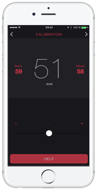
How dB Pro works
Open the app and you are greeted by a large, readable decibel display with the current SPL value. From there you can switch modes based on what you are doing. If you want a quick exposure check, use the noise dosimeter to understand how long you can safely stay in a loud environment. If you are troubleshooting sound in a room or calibrating speakers, open the spectrum analyzer to see frequency content and adjust accordingly. If you want evidence of noise, use the photo or video overlay to capture an image or clip with the dB readings stamped on it and export that file. For a quick self-check of your hearing, run the integrated test and get a simple audiogram in a few minutes. The site emphasizes that the toolset is designed for both everyday users and audio-curious folks who want more control.
Features Decibel Meter Pro
1) Noise dosimeter for exposure awareness
The dosimeter view helps you detect dangerous noise without delay. This is useful at work sites, at home with loud tools, or in nightlife settings. The goal is simple. Know when levels are creeping into risky territory and adjust behavior before your ears pay the price.
2) Hearing test with a quick audiogram
A built-in hearing test gives you a snapshot of hearing health according to WHO criteria. In a few minutes, you can generate an at-a-glance audiogram that helps you spot issues early or simply track changes over time if you are listening loudly.
3) Photo and video overlays with export
Sometimes you need more than a number. With dB overlays on photos and videos, you can capture the moment and include the measured decibel value in the media itself. That makes it easier to communicate noise issues to a landlord, venue, event organizer, or coworker. You can export these files to share.
4) Noise Criterion and professional references
The app references professional standards such as the Noise Criterion that are used in places like hotels, schools, and cinemas. If you are assessing an indoor space, having those targets in the app helps you translate raw dB values into something actionable.
5) Spectrum analysis with depth
For audio work and room setup, the spectrum analyzer is where you can go deeper. The site highlights a powerful analyzer with many options that can support everything from tuning large halls to tweaking an audiophile setup at home. This is overkill for casual checks but great to have when you need it.
Security and privacy
The website links to a dedicated privacy policy and centralizes support on a contact page. That indicates a standard approach. For any subscription or data handling questions, you are directed to manage subscriptions through the app and refer to the published policy. If you prefer not to subscribe, you can still use the free features highlighted on the site.
Pros and cons
Pros
1. Accurate, readable sound level meter with extra tools you actually use day to day
2. Practical safety features through the noise dosimeter
3. Quick hearing test that produces an easy audiogram based on WHO criteria
4. Visual evidence workflow with dB overlays on photos and videos, and export support
5. Deep spectrum analysis for rooms, live sound, or studio tweaks.
Cons
1. Exact pricing is not listed on the website itself and is handled by the app stores
2. Advanced views can feel busy at first and may require a little practice
3. As with any phone-based SPL tool, ultimate accuracy depends on your device’s microphone and calibration environment
Alternatives to Decibel Meter Pro
1. Decibel X
A well-known meter with pre-calibrated profiles and a solid reputation. It is strong for straightforward SPL checks and supports multiple weightings on many devices. Decibel Meter Pro pulls ahead if you value the integrated hearing test, Noise Criterion references, and the media overlay workflow that lets you export photos and videos with stamped dB readings.
2. NIOSH SLM (CDC)
This is a respected research-grade app focused squarely on occupational noise measurement. It is excellent for safety education and baseline measurements. Decibel Meter Pro is a better fit if you want an everyday tool with extras like spectrum analysis for tuning spaces, an easy hearing test, and the on-device media evidence flow.
3. SPLnFFT or similar analyzer apps
Analyzer-first tools can be very powerful but may feel technical. Decibel Meter Pro balances depth with day-to-day usability and adds the dosimeter and audiogram features for a more rounded package. If you need a single app that moves between home, hobby audio, and simple safety checks, Decibel Meter Pro covers that span well.
Expect fast, legible readings that help you make quick decisions. In a living room, you can dial in speaker placement with the spectrum view. In a workshop, you can see when to put on hearing protection. At a noisy apartment, you can record a short clip with the dB overlay and send it to support your case. If you are curious about your hearing, you can run a test and keep a simple record. The overall feel is approachable enough for beginners and deep enough for enthusiasts.
IBR’s review
For the title, accurate decibel readings on your phone, this app is a strong yes. You get a dependable SPL readout that is easy to read in the moment, plus tools that extend the usefulness far beyond a simple meter. The dosimeter helps you act before exposure becomes risky. The hearing test gives you a quick health snapshot based on clear criteria. The spectrum view brings real utility to home studios and venues. The overlay and export options make it simple to document issues with proof. As an everyday companion for noise awareness and audio setup, Decibel Meter Pro hits the mark.
Ease of Use: 4.5/5
Features: 4.6/5
Template Quality and Exports: 4.4/5
Pricing and Flexibility: 4.3/5
Overall: 4.5/5
Conclusion and whether people love Decibel Meter Pro
Based on the testimonials showcased on the site, people who use Decibel Meter Pro tend to recommend it. They call it accurate, helpful for solving real-world noise problems, useful in professional audio work, and good value when stepping up to Pro. That aligns with our experience of the feature set and the balanced approach to both simplicity and depth. If you want a single app that covers instant readings, exposure awareness, simple hearing checks, and deeper analysis when you need it, Decibel Meter Pro deserves a place on your home screen.
If you are building or scaling a tool like Decibel Meter Pro, Ikana Business Solutions can help you ship the story that converts. From positioning and go-to-market to SEO content, comparison pages, and creator partnerships, we specialize in turning complex features into clear outcomes that customers care about.
Let’s map your growth plan and launch content that ranks and converts. Visit ikana.io to get started.
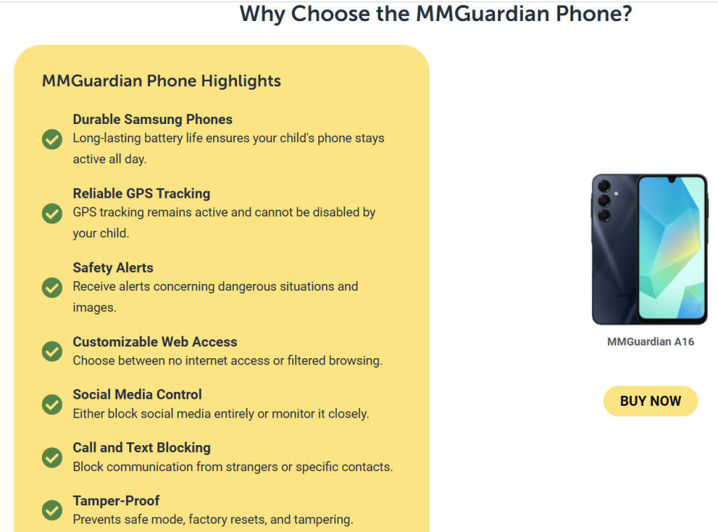
MMGuardian App Review: Protecting Your Child’s Digital World in 2025
Parenting in the phone era is hard.
MMGuardian aims to make it easier by giving you a clear set of tools to manage what your child can access, when they can use their device, and who can contact them. The app focuses on three things parents ask about most: keeping harmful content out, controlling time on screens and apps, and staying informed with alerts and reports. You install the child app on your kid’s device, use the parent app or web portal to set rules, and let MMGuardian handle the monitoring, blocking, and notifications in the background.
The headline differentiators here are detailed message monitoring and safety alerts for risky content in texts and popular messaging apps, along with strong contact management and phone locking. For many families, that mix provides practical control without constant manual checking.

Features of MMGuardian
1) App and Internet Controls you can tune to your family
You can block specific apps entirely or create schedules and limits that fit school nights and weekends. For the web, MMGuardian can disable browsing or automatically block categories of harmful sites and inappropriate content. This is useful if you want flexibility for older kids but firm guardrails for younger ones.
2) Contact management, call and SMS blocking, and phone lockdown
If unwanted contacts are part of the problem, you can restrict calls and SMS to approved numbers or block specific contacts outright. A phone lock feature lets you disable the device on a schedule or on demand, which is perfect for homework time or bedtime. Think of it as a one-tap pause when life needs attention away from screens.
3) Message monitoring with safety alerts
MMGuardian’s message monitoring is built to surface what matters. Parents can view text messages when needed and receive alerts when content in texts suggests risks like bullying, sexting, grooming, drugs, or self-harm. This is not just keyword blocking. The goal is to prompt timely conversations without you having to read everything all the time.
4) Screen time limits and usage reports
Daily and weekly limits, app usage summaries, and activity reports give you a clear picture of how the device is used. You can set rules for overall screen time, per-app time, and quiet hours. This reduces nagging and turns expectations into settings everyone understands.
5) Location tools and simple parent dashboard
You get location tracking and the ability to set rules from the parent app or web portal. The dashboard groups controls like lock, time limits, app control, and browsing into one place so you can adjust quickly. For iPhone and iPad, MMGuardian documents a setup flow that respects Apple’s child account model and adds a desktop sync app if you want iMessage and SMS monitoring.

Pricing
MMGuardian keeps pricing straightforward with family-friendly plans that support up to five child devices. Monthly and annual options are available, and subscriptions apply to the child apps only. The parent app does not need a separate license. There is also an MMGuardian Phone with its own setup flow if you prefer a hardware route.
How MMGuardian Works
- Install the MMGuardian Parent App on your phone and create an account.
- Install the Child App on your kid’s Android phone, iPhone, or iPad. Follow the guided setup to grant permissions and enroll the device under your account.
- On iPhone or iPad, follow the documented steps for child Apple IDs, then finish the in-app setup. If you want text and iMessage monitoring, install the desktop Sync App on a home computer and connect it once.
- Open the parent app or web portal to set up rules for web filtering, app blocking, time limits, location, phone lock times, and contact management.
- Check the dashboard for activity reports and respond to any safety alerts that come in.
The whole flow is designed so you can set the foundation once, then make small tweaks as your child grows.

Security and Privacy
MMGuardian’s privacy policy covers how your data is handled, how access is verified, and how requests are processed. Accounts are protected by credentials, and the company provides contact details for privacy inquiries, including a European representative for GDPR matters. The terms of service reference the privacy policy and reinforce that your use acknowledges the data handling practices. As always, use strong passwords, enable device security on your own phone, and have an open conversation with your child about what you are monitoring and why.
Pros and Cons of MMGuardian
Pros
• Clear guardrails for apps and the web. You can block problem apps, disable browsing for younger kids, and rely on automatic filtering for harmful content.
• Robust contact control. Restrict calls and texts to approved contacts or block specific numbers to reduce harassment and spam.
• Message monitoring with actionable alerts. You get notified about risky content in texts and supported social messaging channels, which helps you intervene early.
• Practical screen time tools. Daily limits, app limits, and schedules keep routines sane without constant arguments.
• Parent-friendly setup and dashboard. The guided setup on Android and iOS, plus the option of a desktop sync app for iPhone text coverage, keeps things understandable.
Cons
• Monitoring is powerful, which means you should set expectations with older kids. Use the alerting and transparency to build trust.
• Some features depend on platform capabilities. Expect slightly different setup steps or coverage on iOS vs Android.
• As with any control app, you still need ongoing conversations. Technology sets guardrails, parenting provides context.
Alternatives to MMGuardian
Qustodio
Qustodio is a well-known parental control suite with web filtering, screen time, location tracking, and reports. It offers Basic and Complete plans with device coverage across platforms and AI-powered alerts on higher tiers. It is a strong generalist.
Why pick MMGuardian instead: if message monitoring and contact control are priorities for your family, MMGuardian’s approach to viewing texts when needed and getting specific safety alerts is a strong reason to choose it. The lock and contact blocking tools are also straightforward if your main issues are phone calls, SMS, and a few risky apps.
Bark
Bark focuses on monitoring content for risks and sending alerts across many platforms. It is popular with families who prefer alerts over full visibility. Bark also sells hardware like Bark Phone and offers two app tiers.
Why pick MMGuardian instead: if you want both alerts and the option to view messages directly when necessary, plus stricter app blocking and contact rules inside one dashboard, MMGuardian may fit better. It strikes a balance between proactive alerts and hands-on controls.
OurPact
OurPact is known for scheduling, screen time management, app blocking, and location features, with a Premium+ plan that adds screenshots on demand. Families that want iOS-friendly scheduling and quick app pauses like it.
Why pick MMGuardian instead: if your priority is stronger text and contact management along with web filtering that can be set to automatic blocking, MMGuardian is more tailored to those needs. You still get time limits and phone lock, but with deeper communication oversight.
What to Expect from MMGuardian
Expect a tool that sets firm boundaries with flexible rules. You can start strict for younger kids and gradually open access as they prove responsibility. The dashboard gives you a steady rhythm: review alerts, skim the usage report, extend or tighten limits, and move on with your day. If you prefer to check only when something is wrong, rely on safety alerts. If you want to be more involved, the message monitoring view is there when you need it. Over time, most families settle into a routine where the rules live in the app, not in daily debates.
IBR’s Review
Short verdict. MMGuardian is a good fit if your top concerns are harmful content, risky contacts, and message safety. It combines practical controls with alerting so you are not glued to logs. Setup is guided, the rules are clear, and the parent dashboard is easy to learn. If you only need gentle time limits and a few website blocks, a lighter app could be enough, but for families that want stronger oversight of texts, calls, and apps, MMGuardian delivers what most parents look for in a single place.
Based on its feature set, pricing, and the way setup and controls are presented, MMGuardian is easy to recommend for families seeking a strong blend of blocking, limits, and message-level insight. Parents who value alerts and the option to review texts when needed will likely be happy with it. If your home has both younger kids and early teens, the ability to start with strict rules and loosen them later is practical. In short, this app aligns well with what many parents say they want from modern parental controls. If that sounds like your household, MMGuardian is worth a serious look.
Ratings
Ease of Use: 4.5/5
Features: 4.6/5
Template Quality & Exports: 4.2/5
Pricing & Flexibility: 4.5/5
Overall: 4.5/5
If you are building a family-safety or productivity app, Ikana Business Solutions can help you position the product, craft clear messaging, and build repeatable growth engines through content, SEO, partnerships, and conversion-first landing pages. We translate complex features into simple stories that families understand. Let’s plan a focused go-to-market and scale it with data. Visit ikana.io to get started.
Crypto App Review: The All-in-One Gateway to the Digital Economy
Crypto.com positions itself as an all-in-one platform for everyday users who want to buy, sell, trade, spend, and earn on digital assets without juggling multiple services. From a single app, you can purchase hundreds of cryptocurrencies, move funds, set price alerts, access a Visa card with crypto rewards, and route more advanced trades to the Crypto.com Exchange. The homepage leans into breadth and convenience. For a typical user, this means you can start with simple purchases, and as you become more comfortable, you can explore additional tools without leaving the ecosystem.
The company’s support hub is extensive. New users receive step-by-step guidance for onboarding, funding, common actions within the app, and product-specific assistance. That lowers the learning curve if this is your first crypto account. Combined with a clean interface and straightforward navigation, the overall experience feels approachable while still offering depth for those who want it.

Features of Crypto App
1) Buy, sell, and trade across a large catalog
The app supports a wide list of assets with simple purchase flows and live pricing. You can set recurring buys if you want to dollar-cost average, or switch to the Exchange to place maker or taker orders with a transparent fee schedule. For newcomers, the app flow removes friction. For intermediate users, the Exchange provides more granular order control and lower trading fees when you provide liquidity.
2) Crypto.com Visa Card for everyday spending
Crypto.com offers a Visa card program where you can top up from fiat or convert crypto to spend at regular merchants. Rewards are tiered by card level and region. The headline idea is simple. You can earn a percentage back on purchases, take advantage of interbank exchange rates in supported regions, and in some markets access extra perks tied to higher tiers. The card is useful for people who want to keep value in digital assets but still spend easily in stores or online.
3) Rewards and yield options inside the ecosystem
Within the app, you will find product paths to grow idle balances or collect rewards. The options and terms vary by jurisdiction, user tier, and asset. For many users, the draw is convenience. You see your balances, available programs, minimums, and timelines in one place. Crypto.com also runs periodic promos and seasonal campaigns, which appear in the app or Exchange banners. These promos often add a small lift to base rewards or fee discounts.
4) A guided app experience with clear help content
The user guide lays out the basics with screenshots and links to deeper articles. Sections cover account setup, verification, deposits and withdrawals, converting between crypto and fiat, card usage, and troubleshooting. It reads like a friendly manual rather than a dense knowledge base. This matters because crypto tasks often feel technical. In the Crypto.com app, the steps are broken down into small actions that feel familiar if you have used any modern fintech app.
5) Proof of Reserves verification and security posture
Crypto.com highlights a Proof of Reserves program that lets customers independently verify that customer assets are held 1:1 in reserve using a Merkle-tree process. The company also publishes claims about certifications and controls, and it documents a security model that includes cold-storage custody, infrastructure standards, and external attestations. For users who care about counterparty risk, this is one of the most visible signals the company puts forward
Pros and cons of Crypto
Pros
1. One app for many jobs. Buy, trade, withdraw, spend on a Visa card, and track your portfolio without juggling multiple accounts.
2. Onboarding and guidance feel beginner-friendly. The help center and app user guide are well structured, which reduces friction.
3. Exchange fees are published with maker and taker tiers that reward volume and liquidity provision. That gives active users a clear path to lower costs.
4. Security and transparency signals are prominent. Proof of Reserves verification and published certifications give risk-conscious users more to evaluate.
5. Regionalized products. The platform adapts features for different markets, which can be a benefit if you travel or relocate.
Cons
1. Pricing varies by product and region, which makes the real cost picture more complex than a single headline rate. Users should check the fee page and card terms for their country and tier.
2. Rewards depend on card level and local program rules. To reach top perks, you may need higher card tiers or subscription programs, so plan for the total cost of participation.
3. Advanced traders may still want external tools for charting, automation, or derivatives that go beyond the Exchange feature set available in their jurisdiction.
4. The breadth of features adds cognitive load. New users can feel overwhelmed until they settle on a simple workflow for buying, spending, and securing funds.
Pricing
Crypto.com publishes a fees and limits schedule for the Exchange that shows tiered maker and taker rates based on your 30-day volume and whether you hold or lock the native token. At the entry level, maker fees are higher than at pro tiers, while taker fees start at a simple percentage and step down as volume grows. Derivatives products and specific order types use their own maker and taker schedules.
In the app, you will also find an Applicable Fees section that outlines where fees can apply across products. Examples include network fees for blockchain withdrawals, potential card program fees such as ATM or international usage where relevant to your region and tier, and other product-specific charges. Because the platform operates across many countries, the exact numbers depend on where you live and which products you enable.
The Visa card program publishes benefits and program notes by market. In many regions, you can earn a percentage back on purchases and benefit from interbank rates, with details defined by the card agreement and local help pages. Before applying, it is worth scanning your market’s card FAQ to confirm top-up options, limits, and any fees for ATM withdrawals or foreign currency transactions.
The big takeaway. Crypto.com centralizes its fee tables, but your personal pricing depends on three things. Your jurisdiction, your chosen products, and your usage. Look up the Exchange fee tier that matches your activity, review app fees relevant to deposits, withdrawals, and conversions, and check your local card terms before you commit.

How the Crypto App works.
1. Create an account and complete verification. The app guides you through identity checks and security setup.
2. Add a funding method. Depending on where you live, you can link a bank account, use a card top-up, or deposit crypto to a wallet address.
3. Buy your first asset. Start with a small amount. You can use a simple buy flow or place an order on the Exchange for more control.
4. Secure and organize. Turn on two-factor authentication, label your whitelisted withdrawal addresses, and set price alerts.
5. Explore extras. If you plan to use the Visa card, complete the card application for your region and tier. If you want lower fees on the Exchange, review the maker and taker tiers. If you want rewards, review the programs available to you inside the app.
6. Keep records. Use statements and exports in the app and Exchange to track your activity for tax or accounting.
This path gives new users a safe start while leaving room to add features later without opening more accounts.
Security and privacy of Crypto
Crypto.com presents an industry-standard security stack. The company describes an infrastructure with cold storage for customer assets, risk monitoring, and operational controls. It also highlights compliance achievements and privacy notices that map how personal data is collected and processed across products and geographies. Users are encouraged to use two-factor authentication, enable withdrawal protection features, and review Proof of Reserves to verify balances in the reserve snapshot.
From a practical standpoint, this blends company-level assurances with user-level controls. The platform commits to security frameworks and third-party attestations. You commit to good habits inside your account. If you take the time to set strong authentication, stick to whitelisted addresses, and avoid connecting your account to untrusted devices, you will get the most out of the platform’s protections.
Alternatives to Crypto
Coinbase
Coinbase is the most mainstream option in many countries, with a strong focus on user experience and regulatory clarity. It is an excellent choice for simple buys, recurring purchases, and easy fiat on and off ramps. Where Crypto.com can pull ahead is the all-in-one promise. The Visa card program, the integrated Exchange fee tiers, and the emphasis on a complete financial app will appeal to users who want spending and trading under one roof.
Kraken
Kraken is known for a robust security culture and a loyal base of intermediate to advanced traders. It offers strong order types, OTC services, and a straightforward interface with fewer promotions. Crypto.com looks stronger for users who want a lifestyle angle with a card, rewards, and an app that feels more like a modern neobank experience, while still offering an Exchange if you want it.
Binance
Binance is a feature juggernaut where available, with deep liquidity and broad product lines for advanced traders. It can feel overwhelming to newcomers. Crypto.com’s advantage is a calmer starting point, clearer regionalization, and a focus on card-based spending that blends your crypto life with daily payments. If you are optimizing purely for derivatives depth in allowed regions, Binance wins. If you want a balanced everyday app that covers buy, spend, and save in one place, Crypto.com may be a better fit.
What to expect from Crypto
Expect a polished mobile experience that feels like a modern fintech app. You can buy well-known assets quickly, set alerts, and get guided help without reading forums. If you want to spend your balance, there is a clear path to a Visa card. If you want to trade more actively, the Exchange is a tap away. The tradeoff is that pricing and benefits depend on your region and account tier. Be prepared to check your local terms before you rely on a headline.
IBR’s review
If your goal is to manage crypto in one app from buying to spending, Crypto.com is a solid pick. The guided setup, large asset catalog, and integrated Visa card make it easy to put digital assets to everyday use. The Exchange fee table is transparent, and there is a clear path for active users to reduce costs. Proof of Reserves and visible security materials add confidence for risk-aware customers. The caveat is complexity. Because pricing, rewards, and even product availability vary by region and tier, you should skim the fee page and your local card FAQ before going all in. Do that homework, and you will find that Crypto.com delivers on the convenience it advertises.
Ratings
Ease of Use: 4.6/5
Features: 4.5/5
Template Quality and Exports: 4.1/5
Pricing and Flexibility: 4.⅖
Overall: 4.4/5
Crypto.com is easy to recommend to beginners who want a single app that does the basics well and leaves room to grow. The shopping list is compelling. Buy and sell popular assets. Spend with a Visa card. Access an Exchange with published fees and volume tiers. Verify reserves and review security details in plain language. People who value convenience and a familiar mobile banking experience tend to love that combination. More advanced traders who need specialized tools may prefer to pair Crypto.com with a dedicated pro terminal. For everyone else, the platform earns a spot on any shortlist, and it is reasonable to recommend it once you confirm your local pricing and benefits.
If you are building a crypto or fintech brand and want content, PR, and growth that compels users to try your product, Ikana Business Solutions can help you launch and scale. We turn complex features into clear stories, build SEO content that ranks, and ship landing pages that convert. See how we approach go-to-market and brand lift at https://ikana.io.
Reflectly App Review (2025): Guided Journaling for Wellbeing
Reflectly presents itself as an intelligent journal and mental health companion. The core promise is simple: use AI prompts and structure to make daily reflection easier, so you can process negative thoughts, amplify positives, and learn practical wellbeing habits over time. The experience is mobile-first with a minimal interface, quick entries, and smart cues that nudge you to write even on busy days.
Features of Reflectly App
1) AI-guided reflections
Reflectly uses AI to guide the session, helping you structure what happened, how you felt, and what you want to do next. This lowers the mental friction of “what do I write about” and keeps entries focused on actionable takeaways.
2) Daily questions, quotes, and themed content
Beyond free-form entries, Reflectly includes rotating reflections and questions, plus inspirational content and wellness material that keep journaling fresh. Subscribers can access more of this content library, which can include audio or meditative experiences depending on the app version.
3) Mood and activity tracking with stats
You can record moods, related activities, and notes, then review patterns over time. Seeing correlations between activities and feelings helps you decide what to do more of and what to avoid.
4) Backup, sync, widgets, and exports
Subscription tiers may unlock unlimited entries or trackers along with backup, sync, authentication, and widgets. The ability to export or manage data makes it more practical for long-term journaling and switching devices without losing history.
5) Optional health and biometric integrations
Reflectly can work alongside platform features such as biometric lock on device and, where supported, share or reference certain health-related data types with explicit consent. This adds privacy protection on-device while making wellbeing journaling more complete for people who track habits in one place.
Pros and cons
Pros
- Easy to start, thanks to AI prompts and short guided flows that reduce blank-page anxiety.
- Journaling meets mood tracking, so entries turn into trends and insights you can act on.
- Subscription features like backup, sync, and exports make Reflectly viable as a primary journal rather than a weekend side tool.
- The app positions itself as a wellbeing companion, not just a text box, which keeps motivation high.
Cons
- Exact feature availability can vary by platform and subscription status, and the company reserves the right to change features over time.
- Pricing is shown at checkout rather than on a public pricing grid, so you decide on value during the upgrade flow rather than comparing plans on a page.
- While guided content is helpful, people who want a pure free-form notebook may find the prompts unnecessary.
Pricing
Reflectly operates on a freemium model. You can use the app with a non-subscription license, then upgrade in-app or through a website flow to unlock subscription features. Plans auto-renew per the mobile store or account settings, and purchases are managed through your App Store or through a company-controlled website account depending on where you bought. The terms also mention one-time purchases and bundles controlled by Reflectly. Prices and promotions are shown prior to purchase within the store or checkout flow.
How it works
Open the app and you are greeted with a simple daily check-in. Answer a short set of questions or a prompt, tag a mood, and add any relevant activities, notes, or images. On subsequent days, Reflectly nudges you back with fresh reflections or quotes. Over time, your log builds into a private timeline that surfaces patterns and small wins. With a subscription, backup, and sync, keep entries safe across devices and unlock quality-of-life features like widgets and expanded content.
Security and privacy
Reflectly ApS states that it processes personal data in accordance with the EU GDPR. Certain data like mental health entries are treated as special category data and require explicit consent. If you enable biometric authentication, the app relies on your phone’s native system so Reflectly does not store your fingerprint or face data. The policy details the lawful basis for processing, clarifies optional newsletter consent, and lists categories of service providers such as analytics, subscription infrastructure, payment, and mailing partners along with their regions. You can back up, synchronize, export, or delete data consistent with your rights as a data subject.
Alternatives to Reflectly
Day One is a long-standing premium journal known for beautiful design, rich media, and cross-platform sync. It is ideal if you want a classic diary with powerful export and publishing options. Reflectly’s edge is its AI-guided reflection and dedicated wellbeing framing that helps people who struggle to start writing actually build the habit.
1. Journey
Journey focuses on multi-platform journaling with templates, calendar views, and coaching-style prompts. It suits people who want a structured life log. Reflectly is simpler and more wellness-centric out of the box, which can feel less overwhelming for beginners.
2. Stoic
Stoic blends journaling with CBT and stoicism-inspired exercises. If you want a daily mental fitness coach, Stoic is strong. Reflectly feels lighter and more approachable for straightforward mood journaling, especially if you want quick prompts instead of lesson modules.
Note: these alternatives are strong in their own right. Choose based on your preference for classic diary power features, multi-platform logging, or philosophy-driven exercises.
What to expect
Expect a calm, minimal app that gets you writing in under a minute. Expect short reflective prompts that make you think without turning journaling into homework. Expect to see simple trends in how you feel across weeks and to spot a few triggers or habits that consistently shape your mood. If you upgrade, expect backup, sync, and more content so your routine survives phone changes and busy seasons.
IBR review
In brief, Reflectly is a good fit if your goal is to build a consistent journaling habit for wellbeing. The app removes friction with guided prompts and keeps momentum with small daily cues. The mood and activity log gives you just enough data to notice patterns without turning your journal into a spreadsheet. If you are already happy with a raw notes app or you want a deep therapy program, this will feel light. For most people who want a friendly place to reflect, Reflectly meets the moment and is easy to recommend.
Based on the product’s positioning and feature set, Reflectly delivers what many users want from a wellbeing journal: quick prompts, private space, and gentle motivation. We recommend it for beginners and busy professionals who need a nudge to write and a simple way to track mood. If you crave a classic diary with heavy export controls or a full mental-health curriculum, consider the alternatives above. For most everyday journalers, Reflectly is worth downloading and trialing for a week to see how it fits your routine.
Ratings
Ease of Use: 4.6/5
Features: 4.3/5
Template Quality and Exports: 4.0/5
Pricing and Flexibility: 4.1/5
Overall: 4.3/5
If you are building a health or productivity app, Ikana Business Solutions can help you grow with positioning, ASO, SEO content, and conversion-focused landing pages. We turn features into clear user value and measurable acquisition.
Let’s plan your next 90 days of growth. Visit ikana.io.
TextNow App Review (2025): Free Texting, Calling, and Voicemail
TextNow is a mobile and web service that gives you a free US phone number for calling and texting. You can use it over Wi-Fi without a SIM, or pair it with a TextNow SIM to get nationwide talk and text and limited “essential” data on the go. The pitch is simple: remove the monthly bill by funding the service with ads, then offer low-cost add-ons if you want more. In practice, TextNow feels like a bridge between a Wi-Fi calling app and a budget carrier. You get a real number, voicemail, group messaging, and the option to upgrade to remove ads, keep your number permanently, or buy larger data passes. If you need inexpensive connectivity for a spare phone, a side project, kids, or a travel backup, it is one of the most approachable options.
Pricing
TextNow’s free tier includes unlimited nationwide calling and texting, a free local number, and ad-supported usage. If you add a TextNow SIM, you can use talk, text, and a small bucket of essential data without Wi-Fi. Paid add-ons exist for ad removal, number locking, premium numbers, and data upgrades. Weekly Ad-Free+ and Lock-In-Number prices are shown in the app listings and TextNow’s help center. There are also paid data plans that start at zero per month for the Free Flex option and scale up for more high-speed data. International calls and certain premium features are pay-as-you-go or subscription-based. The big idea to remember is that you can start for free, then selectively pay only for the bits you care about.
How it works
- Download the app and pick your free local number.
- Use Wi-Fi for free calling and texting right away.
- If you want cellular coverage, order a TextNow SIM, pop it in an unlocked compatible phone, and follow the in-app activation steps.
- Once activated, your calls and texts use TextNow’s network connection through the app. On the Free Flex plan, you also get limited access to essential apps without paying for a full data plan.
- From the app’s Store, you can add upgrades like Ad-Free+, Lock-In-Number, premium numbers, call forwarding, or extra data.
The core experience is VoIP over Wi-Fi with a real ten-digit number. The SIM simply brings that same app experience to the road so you can call and text when you are away from Wi-Fi.
Features
1) Free local number with voicemail and transcription
TextNow assigns you a local US number in minutes. Voicemail is built in, with the ability to turn on transcription so you can skim messages instead of dialing in. You can set custom greetings and manage voicemails like regular conversations inside the app. For everyday use, the voicemail experience is simple and good enough, and transcription is a genuine time saver.
2) Unlimited talk and text across the US on Wi-Fi and on the go
On Wi-Fi, your calling and texting are unlimited and free. Pairing a TextNow SIM lets you keep that unlimited calling and texting when you are away from Wi-Fi. It behaves like a carrier for voice and text, while data is handled as “essential” access on the free tier or as paid high-speed data if you buy a plan. This gives you a working phone without the usual monthly bill.
3) Free Flex data for essential apps
With a SIM, TextNow’s Free Flex setup includes a limited allowance for essential apps like maps, email, and rideshare so you can still navigate, confirm pickups, or read messages without paying for a full data plan. It is not meant for streaming or heavy social media, but it keeps you functional between Wi-Fi stops.
4) Ad-Free+ and number management upgrades
The service stays free by showing ads in the app. If you dislike ads or want more capabilities, Ad-Free+ removes advertising and unlocks extras like call forwarding and better support for verification codes. If you want to make sure your number never gets recycled for inactivity, a separate Lock-In-Number upgrade keeps it tied to your account.
5) Bring-your-own-device and quick SIM activation
You can use TextNow on almost any modern smartphone over Wi-Fi. When you want cellular service, order a SIM, pop it into an unlocked GSM-compatible phone, and follow the activation flow. Activation is guided and usually quick. There are device-specific guides and troubleshooting pages if you need help.
Security and privacy
TextNow runs on standard modern infrastructure and publishes a detailed privacy policy that explains what data it collects and how it uses it. Communication is transmitted securely, and your account controls live in the app and your TextNow profile. Like most consumer VoIP services, end-to-end encryption is not advertised for calls and messages, which means TextNow can comply with valid legal requests. You should also assume that certain features, such as voicemail transcription, rely on cloud processing. If you are highly sensitive about metadata or require end-to-end encryption, a privacy-first messenger is a better fit. If your goal is low-cost phone service with a normal phone number, TextNow’s model is typical for the category.
Pros and cons
Pros
• Truly free calling and texting on Wi-Fi with a real phone number.
• Option to add a SIM and keep calling and texting when you are away from Wi-Fi.
• “Only pay for what you need” model with low-commitment add-ons.
• Voicemail and transcription inside the conversation view.
• Easy to set up on old or spare phones for kids, travel, or a second line.
Cons
• Ads support the free tier unless you upgrade.
• Free cellular data is limited to essential use. You will want a paid plan for heavy mobile data.
• Verification codes from some services can be hit or miss unless you use number-lock or a paid upgrade.
• Emergency calling and carrier features can differ from traditional postpaid carriers.
• Coverage and call quality depend on your device, reception, and Wi-Fi reliability.
Alternatives to TextNow
Google Voice
Google Voice provides a free number with calling, texting, voicemail, and solid call forwarding. It integrates well with Google accounts and is excellent if you live inside Google’s ecosystem. Voice is particularly strong for voicemail management and desktop calling. Where TextNow wins is the free-to-start cellular experience. With a TextNow SIM, you can make and take calls and texts away from Wi-Fi without subscribing to a traditional carrier, something Google Voice does not bundle.
TextFree by Pinger
TextFree offers a free number for texting and Wi-Fi calling, plus paid upgrades. It is straightforward, with a clean web interface, and it works well if you want a light second line online. TextNow’s advantage is its SIM and Free Flex option that brings calling and texting to cellular without a monthly plan. If you need a low-cost, everyday phone experience, TextNow is the more complete option because it behaves like a carrier substitute once the SIM is in.
Talkatone
Talkatone gives you a free US or Canadian number for Wi-Fi calling and texting and sells inexpensive international credits. It shines as a travel companion when you have Wi-Fi. TextNow beats it when you want a single app that can be your main number on the road, too. The TextNow SIM plus upgrades let you step up from Wi-Fi-only to a no-bill phone with add-ons as needed.
What to expect from the app
On Wi-Fi, calls ring like a normal phone and messages arrive quickly. The interface focuses on conversations, not carrier settings, which keeps things simple. Expect to see ads unless you buy Ad-Free+. If you use the free cellular option, map routes, bank OTPs, and rideshare checks typically work, but you will feel the limits if you try to scroll social feeds or stream. Voicemail transcription is handy in noisy places. Battery use is similar to other VoIP and messaging apps if you allow background activity. For reliability, keep the app updated, grant the recommended notifications, and turn on the in-app calling settings for your device model.
IBR review
If your purpose is to get a working US phone number with free calling and texting, TextNow is a good fit. It shines for budget situations, spare devices, and anyone who lives on Wi-Fi most of the time. The SIM option makes it practical on the road without a monthly bill, and the upgrades are clear if you need no ads, a locked number, call forwarding, or more data. It is not a privacy messenger and it is not trying to be a full-fat postpaid carrier. Used for what it is built to do, it delivers a lot of value.
Ratings
Ease of Use: 4.4/5
Features: 4.2/5
Template Quality and Exports: 3.9/5
Pricing and Flexibility: 4.8/5
Overall: 4.⅗
Conclusion
People who value price over polish tend to love TextNow. The App Store and Play descriptions highlight a large user base and high average ratings, and TextNow promotes strong satisfaction metrics on its site. Community forums and third-party reviews show a mix of praise for the free calling and criticism when users expect unlimited high-speed data for heavy use. In our view, most users who understand the limits recommend it to friends who need a backup line or a near-free main line. If you want a conventional plan with lots of LTE data, pick a carrier. If you want to talk and text for free, TextNow is an easy yes.
If you run a communications app or MVNO, Ikana Business Solutions can help you position your plans clearly, reduce churn with better onboarding content, and ship SEO pages that convert. From pricing pages to lifecycle emails and paid landing tests, we turn features into revenue. Let’s plan your next growth sprint at ikana.io.
Kindu App Review: Ideas and Games to Boost Connection
Kindu is a couples app built to spark conversation and connection through curated prompts, games, and idea cards. Instead of forcing heavy relationship talks, it nudges partners to explore intimacy, date ideas, and boundaries in a private space that is easy to use. The basic flow is familiar if you have tried relationship or intimacy card apps before. You browse ideas, each partner indicates interest, and the app only reveals matches you both agree on to reduce awkwardness. Several write-ups describe Kindu as a prompt based system with themed packs and a simple matching mechanic meant to act as a bridge for sensitive topics.
Features
1) Private Matching on Sensitive Topics
Both partners react to prompts with simple choices. If both pick a positive or curious response the idea becomes a match and appears in a private list you can act on later. This keeps pressure low and provides a safe way to communicate preferences that are difficult to express out loud. Descriptions of Kindu highlight this as the core mechanic and it is the part couples tend to value most.
2) Themed Idea Packs and Categories
Kindu is known for having a wide range of themed decks that span lighthearted date ideas, intimacy suggestions, playful challenges, and conversation starters. Some roundups also note the option to add your own ideas to tailor the experience. If you have been together for years or are in a long distance phase this variety helps you avoid the same three date night options.
3) Low Effort Conversation Starters
Small prompts remove the need to plan big talks. You open a deck, react to a few cards, and check your matches later. That cadence is less intense than therapy style exercises and more structured than open-ended chats. It works well if you want a nudge without a heavy program. Overviews frame Kindu as an icebreaker rather than a course.
4) Lightweight Onboarding
Third party listings show straightforward onboarding with account creation and pairing your partner. Some tutorials mention “wildcards” or custom prompts, which allow you to propose your own ideas within the same flow. This keeps everything in one shared inbox instead of scattered notes.
5) Cross Platform Availability and Longevity
Kindu has been around for years which matters for apps in this space. Older listings and mirrors exist for iOS and Android which suggests a long running user base and recurring attention in media guides for couples apps. Longevity alone does not equal quality but it usually means the content set is broad and the workflow is familiar.
Pros and Cons
Pros
- Easy way to surface desires and boundaries without awkward pressure. The private matching flow does the hard part for you.
- Wide variety of prompts and themed packs that go beyond intimacy into dates and connection.
- Simple, low commitment sessions. You can use it in five minute bursts and still feel progress.
- Long standing brand recognition in couples app roundups which makes it easier to convince a partner to try it.
Cons
- Feature depth is lighter than structured relationship coaching apps. You will not find daily therapist led programs or analytics out of the box.
- App store presence and update cadence can vary by region. Some users rely on third party mirrors to install or learn about the app which is not ideal.
- The value you get depends on honest, consistent participation from both partners. That is a people problem more than a product problem.
- Privacy details are not front and center on public pages. You will likely need to review the privacy policy and permissions at install time.
Pricing
Kindu is typically positioned as a free download with optional paid content such as idea packs or upgrades depending on the marketplace where you obtain it. Exact pricing can vary by store and region which is common for relationship card apps. If you see old mirrors or alternative stores, treat those as informational and install only from official channels available in your country.
How It Works
You and your partner install the app and link your accounts.
You pick a deck or category and answer a handful of prompts with simple responses.]
The app reveals matches where both of you agreed.
You browse your private matches and plan what to try next.
You can add your own ideas as custom cards if you want the same friction free yes or no flow on something specific.
That is the entire loop. It is intentionally lightweight so you can do a few cards before bed or during a weekend planning session.
Security and Privacy
Most public write-ups focus on content and matching. A few describe Kindu’s design goal as a private, judgment-free environment that encourages honest sharing. As with any relationship app, treat privacy and safety as first class: install from the official store for your device, do not grant permissions you do not need, and review the app’s privacy policy before backing up any sensitive notes. If you use mirrored APK sites for research, avoid signing in there and prefer official channels.
Alternatives to Kindu
Paired
Paired focuses on daily couple questions, therapist backed tips, and relationship exercises. It leans into communication habits and includes quizzes and micro lessons. If you want a consistent practice with expert content, Paired is strong. Kindu feels lighter and more playful which can be a better fit if you want quick wins and intimacy ideas without a full program.
Gottman Card Decks
Gottman Card Decks is research rooted and brings the Gottman Institute’s prompts to your phone. It is free and offers multiple decks that improve friendship, conflict management, and intimacy through guided questions. Kindu’s advantage is its yes or no matching on shared desires and a wider emphasis on playful ideas, while Gottman is ideal when you want science backed fundamentals.
Spicer
Spicer is a direct alternative with a large bank of intimacy questions, a partner linking workflow, and a match list. It pushes deeper into sexual exploration and offers many levels and packs. Kindu stands out for a softer on ramp and a broader date and connection angle, which some couples prefer when they want to ease in.
What to Expect Day to Day
Expect quick sessions. You will open a deck, answer five to ten prompts, and compare matches later. Over a few weeks you will build a backlog of ideas you both agreed to try, from low effort at home activities to bigger date night changes. If you keep the pace gentle and honest you will notice less guesswork and fewer missed signals. The app is not a replacement for therapy or deep conflict work. It is best used as a friendly bridge that makes those deeper talks easier to start.
IBR’s Review
If your goal is to restart connection with low pressure prompts, Kindu is a good fit. The private match system reduces awkwardness and the themed decks give you fresh ideas when your usual routine feels stale. It shines as an icebreaker and habit starter rather than a coaching program. Use it for a month, set a small daily target, and review matches together once a week. If you want therapist led structure choose Paired. If you want a research rooted foundation choose Gottman Card Decks. If you want a catalog of intimacy questions choose Spicer. For a playful middle ground that still respects consent and privacy, Kindu does the job.
Conclusion: Do People Love and Recommend It
Kindu has been recommended in multiple couples app lists over the years and it keeps showing up because the core idea still works. Couples like the no pressure matching and the variety of prompts that are not only sexual. When both partners commit to a few minutes a day the app tends to earn a place on the home screen. If you want a light, human way to talk about preferences and plan dates without awkward starts, Kindu is worth recommending.
Ratings
Ease of Use: 4.5/5
Features: 4.1/5
Template Quality and Exports: 3.8/5
Pricing and Flexibility: 4.0/5
Overall: 4.2/5
If you are building a relationship or wellness brand, Ikana Business Solutions can help you turn user intent into adoption.
From positioning and brand voice to SEO content, lifecycle emails, and conversion-focused landing pages, our team designs experiments that compound.
See how we work at ikana.io and get a plan you can start this week.